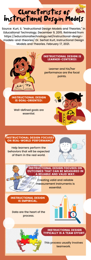
I chose to update the infogrphic about characteristics of instructional design models I created last week. Taking certain crucial design theories and models into consideration, I mainly made great changes in its information source, visual layout as well as background and font colors.
Firstly, I added the information source under the title. It is basic to respect for the original and tell readers where the information is obtained. In this way, I can show readers that I have done related research by listing source and raise the reliability of the poster.
Secondly, I changed the visual layout to a great extent. I added larger white space between each characteristics. According to Merrill’s sixth design principle, white space is like the silence part in the musical composition. In the poster, the design of white space can make characteristics distinguished from each other. What’s more, I added six visual images to support each content. Illustrative image can impress the readers when it relates to specific characteristic. In addition, I changed the proportion in the poster. I enlarged the title of each characteristic and the illustrative image to arouse readers’ interest, and I made the short text letters smaller. According to Merrill’s fifth principle, it is important to establish major and minor areas in the design. With this in my mind, I adjusted a comfortable proportion to keep a sense of balance among texts and images.
Thirdly, I totally changed the background and font colors. In the previous poster, I mainly used green and yellow in the background and white font letters. Therefore, the major characteristics are not obvious and readers might feel a bit tired to read through every word carefully. In the updated poster, I changed the background color into orange-like and white. According to Merrill’s eighth principle, bright colors can make certain elements or information pop. Then, I adjusted the title letters into white with colored background flames and used black font colors in text. According to Merrill’s second principle, colors can be used to stand out the contents form the background, emphasizing the main ideas to make sure readers can see it at first glance. Generally speaking, after adjusting the background and font colors, it is easier to draw the readers’ eyes.
Reference
Merrill, David, mdavidmerrill Merrill on Instructional Design https://www.youtube.com/channel/UCg_gbAhQhBbkj_NK0S211Aw
Leave a Reply
You must be logged in to post a comment.